Hot-Zone States in April vs. June:
Impact of Spiking Cases on Hospitalizations, Deaths, and Recoveries
Edward Lopez, Stephen C. Miller, and Craig Richardson
Click the Button Below to Download a PDF Version of this Issue Brief
Executive Summary
This study compares five hot zone states from Round 1 (Massachusetts, Michigan, New Jersey, New York, and Pennsylvania) to five counterpart states in Round 2 (Arizona, Florida, Georgia, North Carolina, and Texas). In Round 1, cases surged for over a month beginning in April, and in the second round, cases began surging in early June. However, in Round 2 states the spikes in cases are not leading to similar spikes in hospitalizations or deaths as what occurred in Round 1. We find no correlation between deaths on any given day and lagged measures of cases. Instead, we find that daily deaths on a seven-day moving average are not increasing in Round 2 states, and if anything they are decreasing. Meanwhile hospitalizations are increasing in Round 2, but more gradually than they did in Round 1, and still remain at relatively low levels compared to Round 1 states. Our findings suggest the importance of understanding why hospitalizations and especially deaths are not following cases in the same manner as earlier in the pandemic. Data on recoveries could be part of the solution, as Round 2 states generally have higher and, in some places, increasing rates of recovery.
Introduction: Round 1, Round 2, and the importance of comparing
The COVID-19 pandemic in the United States has two different and identifiable “rounds” of infections. Round 1 started back in April and was felt in mostly northern states. Round 2 began in June and was concentrated in certain hot zone states the South and Southwest.
Comparing Round 1 with Round 2 carries enormous policy relevance. For example, one crucial question is whether spikes in daily cases are followed by later spikes in hospitalizations and deaths. Many have expressed grave concern that recent case spikes in Round 2 states will mean spikes in COVID-related hospitalizations and deaths. Former FDA commissioner Scott Gottlieb told Face the Nation, “We’re right back where we were at the peak of the epidemic during the New York outbreak.”[1] State and county officials have followed suit, describing recent spikes in cases as “rising at an alarming rate”.[2]
This study compares five hot zone states from Round 1 (Massachusetts, Michigan, New Jersey, New York, and Pennsylvania) to five counterpart states in Round 2 (Arizona, Florida, Georgia, North Carolina, and Texas). We find no correlation between deaths on any given day and lagged measures of cases. Furthermore, even though cases spiked for over a month in both rounds, the trends in Round 2 states on hospitalizations, deaths, and recoveries are markedly different from those in Round 1 states. We find that, measured on a seven-day moving average, daily deaths are not increasing in Round 2 states, and if anything they are decreasing. Meanwhile, hospitalizations have been increasing over this period in Round 2 states, but gradually so, and they still remain at relatively low levels compared to Round 1 states.
[1] CBS News Face the Nation Transcript, July 5, 2020. https://www.cbsnews.com/news/transcript-scott-gottlieb-discusses-coronavirus-on-face-the-nation-july-5-2020/
[2] Mackenzie Wicker, “Cases rising ‘at an alarming rate,’ top health official says,” Asheville Citizen-Times, July 08, 2020 https://www.citizen-times.com/story/news/local/2020/07/09/covid-19-nc-asheville-buncombe-cases-rising-alarming-rate/5401987002
Do current spikes in cases lead to later spikes in deaths?
For starters, in what ways are Round 1 and Round 2 similar? Figure 1 reports daily cases in the five Round 1 states (combined population of 58 million) compared with the five Round 2 states (79 million). While the levels of case numbers are not directly comparable due to the population difference, the trends show at least one remarkable similarity: new cases in Round 1 increased steadily for a little over a month before declining since late-April, while new cases in Round 2 have (at the time of this writing) been steadily increasing for a little over a month.
Figure 1: New cases in Round 1 and Round 2 States:
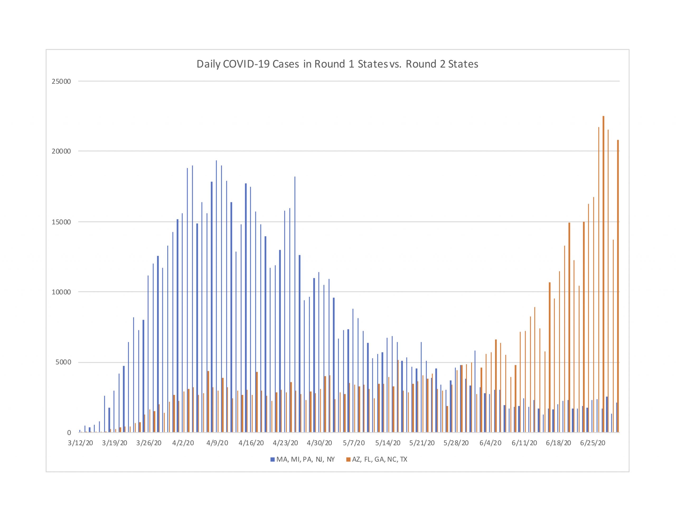
Many have expressed great concern over the spiking case numbers in Round 2 states, based on the idea that today’s spiking cases will lead to tomorrow’s spiking hospitalizations and deaths. Based on our analysis, the evidence does not validate this concern for Round 2 states, even though it was empirically valid during April for Round 1 states.
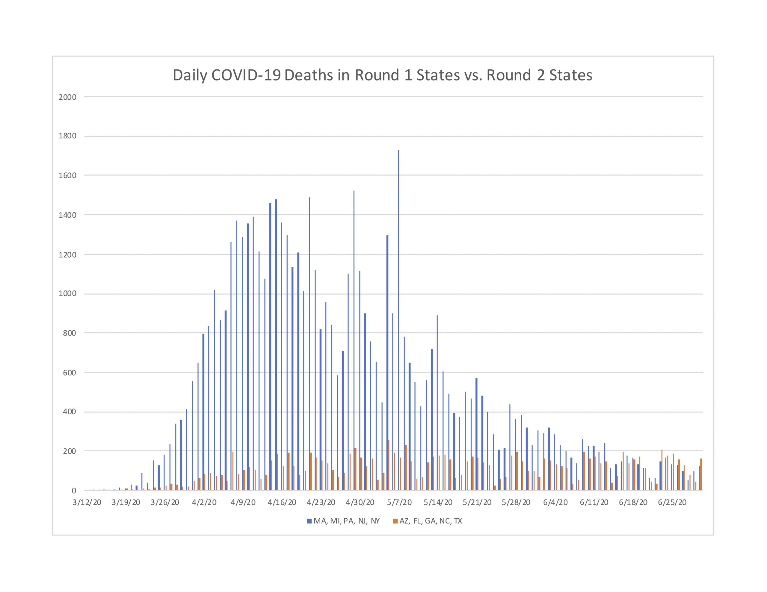
To see this, Figure 2 reports daily deaths on a seven-day moving average for Round 1 and Round 2 states. As you can see, the Round 1 trend shows a hill-shaped profile, with deaths rising rapidly from mid-March through late-May. However, the Round 2 profile is entirely different. Deaths in these later hot zone states shows a very slight increase beginning in late-March, followed by a plateau that continues through to the current date. In other words, deaths in Round 2 states have plateaued since mid-April. If anything the trend has drifted slightly negative since mid-May.
Figure 2: Deaths per day in five Round 1 states compared to five Round 2 states
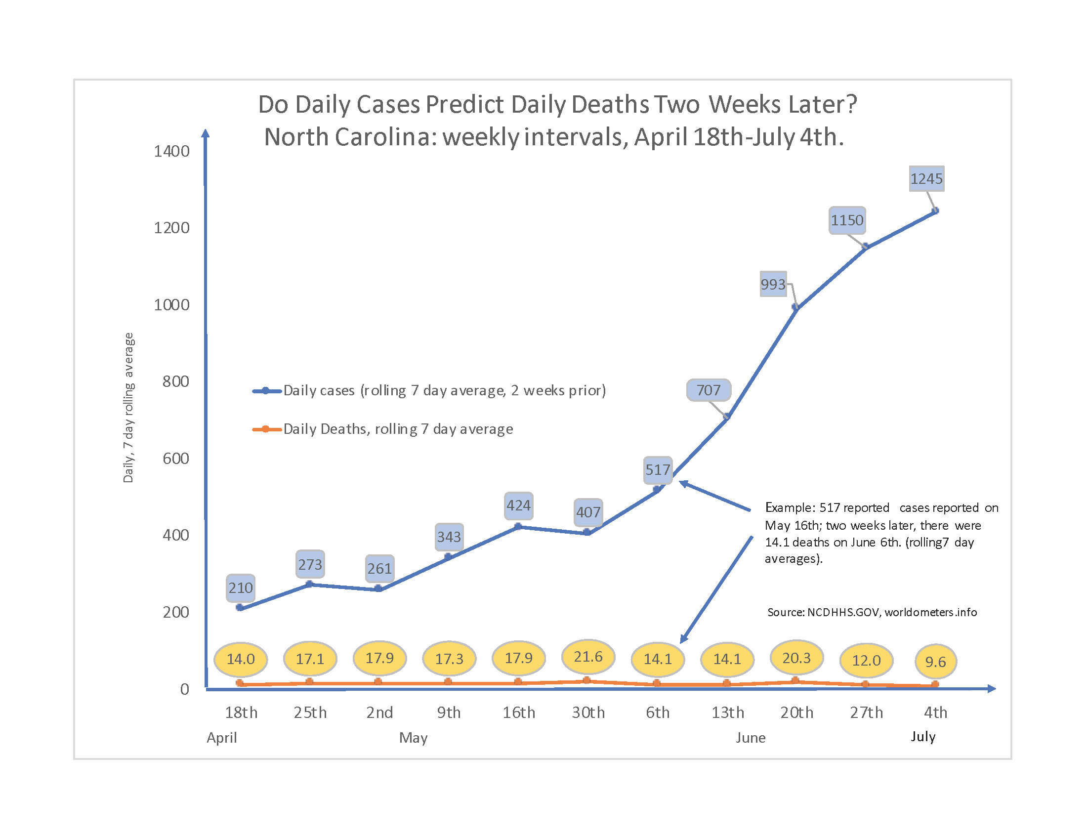
But what about the lagged impact? The concern is that today’s spikes will lead to later hospitalizations and deaths. We can further investigate this claim by measuring cases on a benchmark lag period of 14 days. Figure 3 reports daily deaths and 14-day lagged cases on a seven-day moving average, using North Carolina as an example.
There seems to be no connection between deaths on any given day and cases two weeks prior. For example, compare the two dates May 2nd and June 6th. On May 2nd, the seven-day moving average of deaths came in at 17.9, and this corresponded to 261 new cases two weeks prior. More than a month later on June 6th, deaths had declined to 14 even though corresponding cases two weeks prior had spiked to 517. Over this interval, the empirical relationship is actually negative. By June 20th, cases two weeks prior had skyrocketed to 989, yet thankfully the increase in deaths was far less than proportional, from 14 to 21 on the seven-day moving average. By June 27th, cases two weeks prior had spiked to 1,161, yet deaths had thankfully decreased to 12. Again, spikes in cases may be cause for concern, but that need not include the concern that deaths will soon spike later. If anything, the relationship could be negative.
In summary, Round 2 states have seen deaths plateau since about mid-April. And while it is often repeated that “deaths lag cases,” that concern does not appear to have been the situation in Round 2 states. As one can see, there is still little impact or relationship between cases and daily deaths. If one wants a glimpse into a longer lag, simply slide the numbers in Figure 3 a week or two further in time, and the overall relationship doesn’t change.
Figure 3: Lagged Cases and Current Deaths in North Carolina
How do Round 1 states compare to Round 2 states in hospitalizations?
We can also compare the impact on hospitalizations in Round 1 and Round 2 states. Hospitalizations are arguably the more important metric to study as new cases are detected. The objective behind masking, social distancing, and various local restrictions is to slow the virus’s spread. And the main purpose of slowing that spread is to avoid exceeding health care facility and provider capacity. The level of current hospitalizations indicates how much of that capacity is being used to care for COVID patients whose symptoms are severe enough to warrant admission to a medical facility.
Unfortunately, four states do not track current hospitalizations, and Florida is one of them. Georgia does track current hospitalizations, but did not start doing so until May. Removing Florida and Georgia, Figure 4 below compares the remaining Round 2 states (Arizona, North Carolina, and Texas, combined population of 46.8 million) to four of the Round 1 states (New York, New Jersey, Michigan, and Massachusetts, combined population of 45.3 million).
Figure 4: Current Hospitalizations in Round 1 and Round 2 States
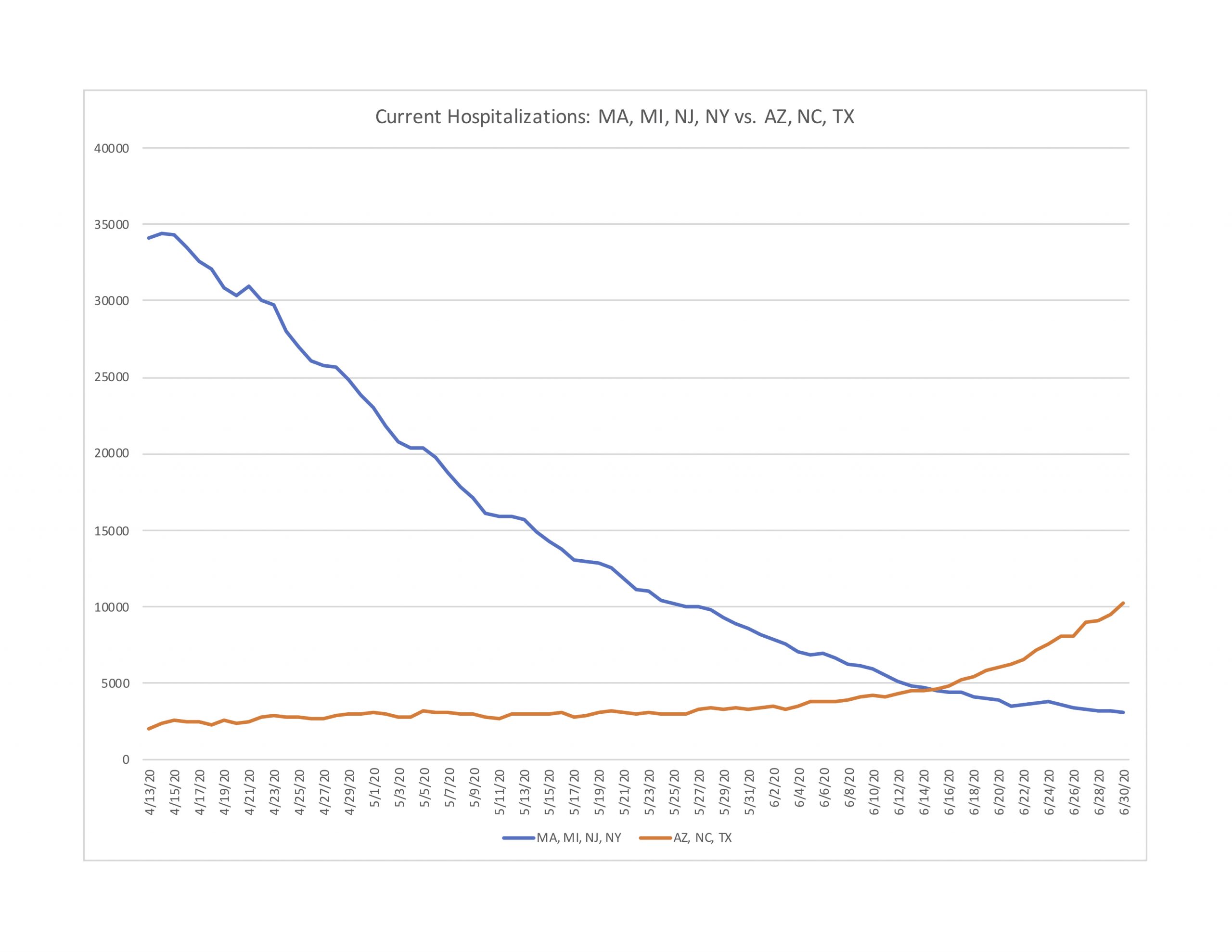
Hospitalizations did increase in Arizona, North Carolina, and Texas during June, but they did so much more gradually than Round 1 states did in April. Even after the recent spike in cases, the combined current hospitalizations in Round 2 states still remain less than a third of the mid-April peak hospitalization numbers in Round 1 states.
We can also compare individual states, as Figure 4-1 does for North Carolina (population is 10.5 million) and New Jersey (8.9 million). As one can easily see, the two profiles are entirely different. New Jersey, saw hospitalizations rise dramatically to over 8,000 on a single day in mid-April, before declining gradually since then. By comparison, North Carolina has seen only a gradual upward drift in hospitalizations. Even at the end of June, New Jersey still had a more elevated number of current hospitalizations. If ever there were evidence of the curve flattening—i.e., keeping it flat in the first place—it could be North Carolina’s trend line of hospitalizations.
Figure 4-1: Current Hospitalizations in North Carolina and New Jersey
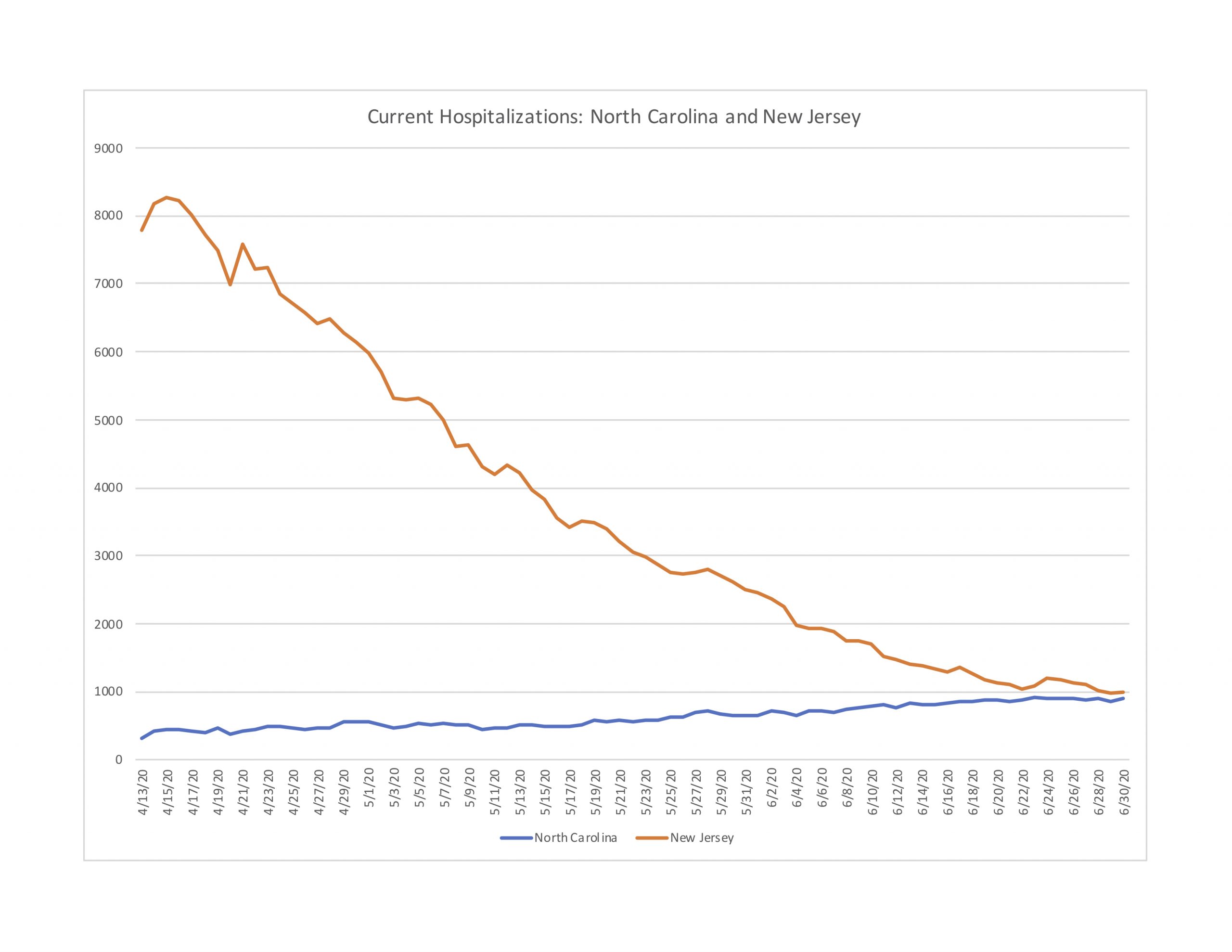
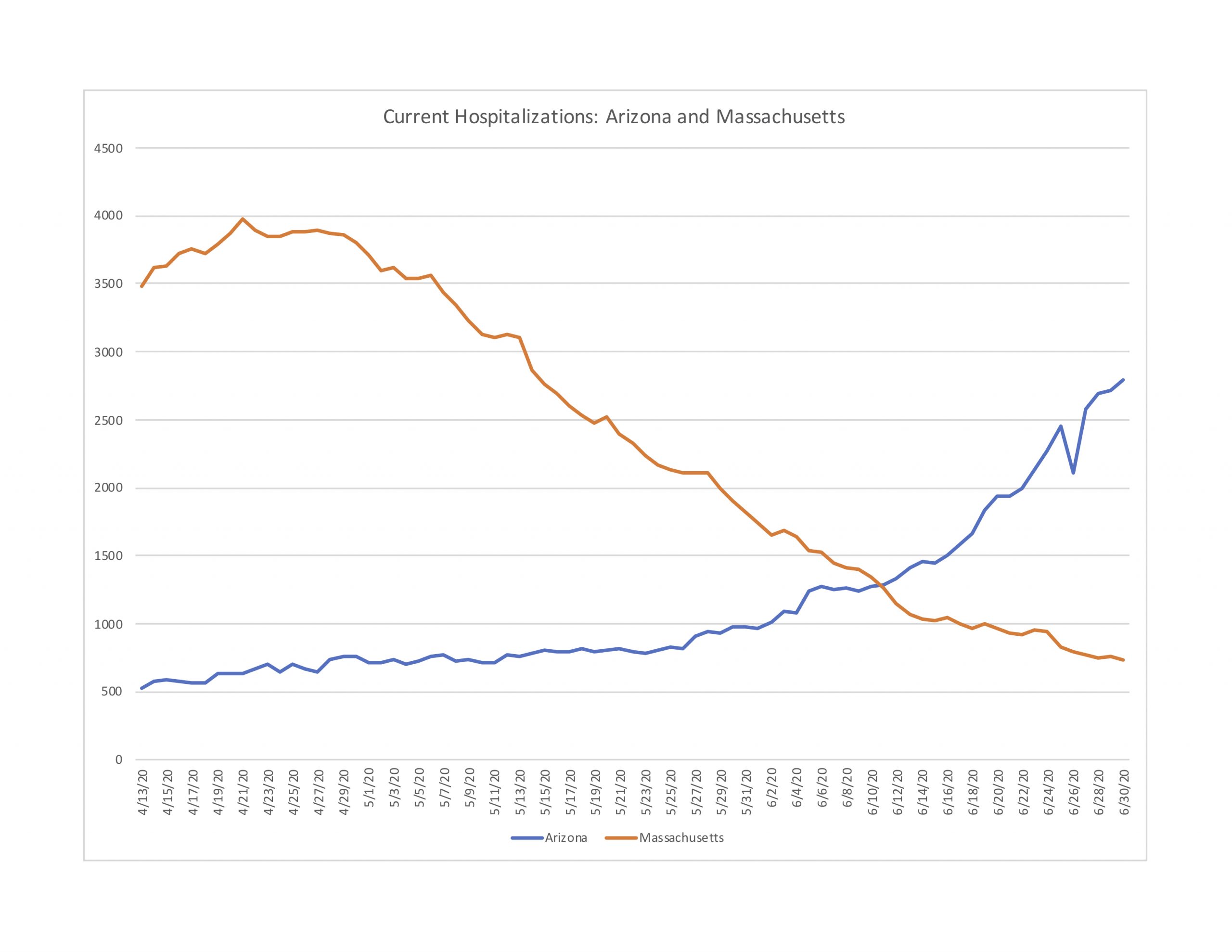
Figure 4-2 next compares Arizona (population 7.3 million) with Massachusetts (6.9 million). Arizona has seen nearly a 190 percent increase in hospitalizations in June. Yet by the end of June, Arizona still has roughly 1,000 fewer current hospitalizations than Massachusetts did at its peak. The good news for Arizona is that the trend in deaths per day is relatively flat, although with some large fluctuations.
Figure 4-2: Current Hospitalizations in Arizona and Massachusetts
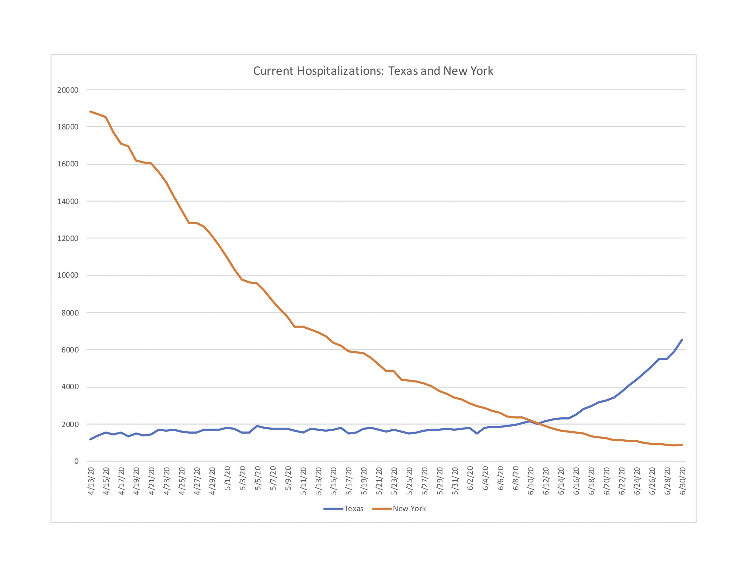
Next, Figure 4-3 makes a similar comparison between Texas (population 29 million) and New York State (19.5 million). Again, despite recent rapid increases in hospitalizations in Texas (272 percent in June), by the end of it had less than a third New York’s peak hospitalizations in mid-April. The trend in Texas is concerning, and worth watching closely. The reason to watch the trend is to guard against overwhelming the health care system’s capacity. Surely New York came very close to doing just that, but it seems unlikely that Texas is close to exceeding its available resources at the moment. The average of deaths per day in Texas at the end of June was actually slightly below what it was in mid-May.
Figure 4-3: Current Hospitalizations in New York and Texas
Finally, even though Florida does not report current hospitalizations, it does report new daily hospitalizations (i.e. how many people were newly admitted each day). Figure 4-4 reports new daily hospitalizations for Florida (population 21.5 million) and New York (19.5 million). Again, despite Florida’s 168 percent increase in reported cases during June, new hospital admissions each day have remained flat.
Figure 4-4: New Daily Hospitalizations in New York and Florida
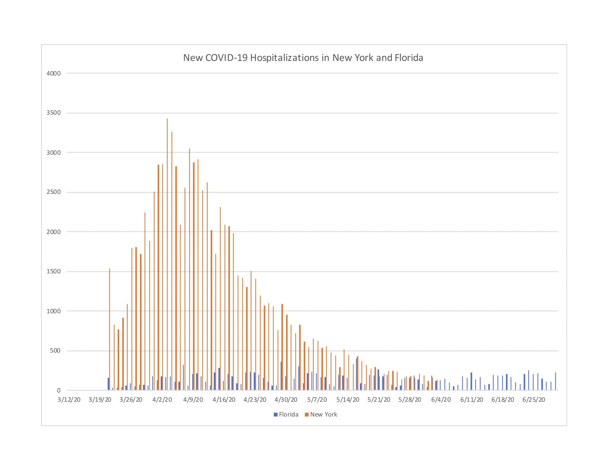
Overall, the hospitalization trends in Round 2 states compared to their Round 1 counterparts is quite revealing. Even after cases spiked dramatically throughout the month of June, the trends in hospitalizations are noticeably stable by comparison, and remain at relatively low levels compared to Round 1 peak periods.
Why are deaths and hospitalizations not spiking in Round 2 as they did in Round 1?
The above results are obviously subject to change as the pandemic continues. However, we think the differences between Round 1 and Round 2 states are important to understand. The obvious question our results raise is: what is different this time? Specifically, why do cases not appear to lead to hospitalizations and deaths in Round 2 as was the Round 1 experience?
First of all, contrary to the calls for alarm, there might be little reason to predict daily deaths to correlate with lagged daily cases. Some positive cases are tested early in the incubation period, others later. Delays in getting test results vary widely by state and swings of testing capacity. And the disease runs quickly through some people, more slowly in others. In light of these points, 14 days is mostly an arbitrary interval. And we might not predict a correlation even at longer or shorter intervals. In short, perhaps the calls for alarm have been misdirected.
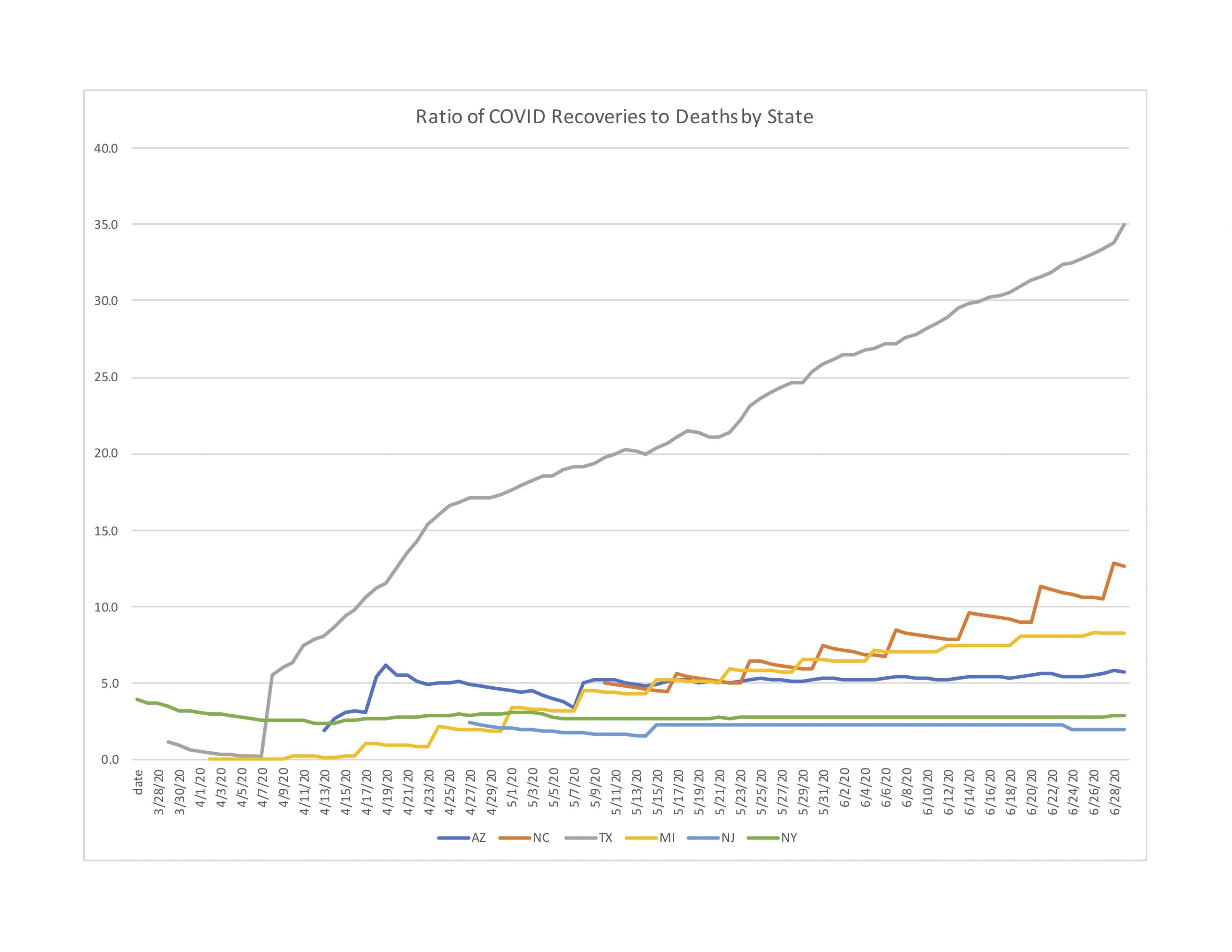
Instead, we think it is worthwhile understanding why spiking cases are not leading to spiking deaths. Part of the explanation may be found by looking at recovery data. All but three of our 10 comparison states provide data on recoveries. And while reporting criteria do vary by state, comparing the ratios of recoveries to deaths can still shed some light on why this round might be different.[3] In this sense, recoveries is a conservative metric because many survivors are not tracked or recorded, which could artificially inflate the presumed number of active cases. Figure 5 reports the ratio of recoveries to deaths for six of our comparison states starting in late March through late June.[4]
[3] In some states a recovery is counted as a hospital discharge. Other states count an infected person as recovered if they are symptom-free for a period of time or have two consecutive negative tests. https://www.dallasnews.com/news/public-health/2020/05/19/why-arent-coronavirus-recoveries-always-reported/
[4] Texas clearly measures recoveries differently Texas records an infected person as “recovered” 32 days after hospitalization if the patient survived or 14 days after being recorded as a case if hospitalization was not required. https://www.texastribune.org/2020/05/18/texas-coronavirus-recoveries/
Figure 5: Ratio of Recoveries to Deaths by State

As Figure 5 shows, the ratio of recoveries to deaths portrays an improving trend in North Carolina. By the end of June, the state’s ratio of reported recoveries to reported deaths was 12.6, meaning that for every 100 hospitalizations an average of 7.4 cases would lead to deaths while the remaining 92.6 cases would become recoveries. The good news for North Carolina is, this ratio has been steadily increasing throughout the duration of available data, beginning about May 10.
Figure 5 also shows North Carolina in relatively good position compared to all but one of the other states. New Jersey and New York flat-lined early on, and have shown no improvement in recoveries to deaths. Meanwhile, North Carolina is not only improving but by the end of June has more than five times the recovery rate as New York / New Jersey.
We want to stress that this is relatively good news. Every increase in cases warrants the utmost concern. But it is important to understand where progress is being made, and why. If we can better understand why hospitalizations and especially deaths are not following new cases in the same large numbers as they did earlier in the pandemic, perhaps we can do more in those directions, to improve the situation even more, and eventually to bring all these numbers down as close to zero as humanly possible.
About the Authors
Edward Lopez (ejlopez@wcu.edu) is Professor of Economics and Director, Center for the Study of Free Enterprise at Western Carolina University. Stephen Miller (scmiller@troy.edu) is the Adams Bibby Chair of Free Enterprise and Associate Professor of Economics at Troy University. Craig Richardson (richardsoncr@wsu.edu) is Professor of Economics and Director, Center for the Study of Economic Mobility at Winston-Salem State University.
Editorial Note
This report is part of CSFE’s COVID-19 research project. For more information and analysis, please visit enterprise.wcu.edu.
About CSFE Issue Briefs
The goal of CSFE Issue Briefs is to provide an accessible educational resource on important issues and fundamental concepts. CSFE Issue Briefs are well grounded in sound scholarship, yet written in plain language for every day readers. Hence the tagline: “Hard Research, Easy Reading.” CSFE distributes the series of issue briefs by email, social media, and its website.
This work is licensed under a Creative Commons Attribution-NonCommercial 4.0 International License. This allows for the work itself, or adaptive or derivative works, to be republished by anyone, so long as CSFE is given attribution and the republishing is for non-commercial uses. Issue Brief authors have attested that this material has not been previously published and does not qualify as self-plagiarism. Direct intellectual property inquiries to csfe@wcu.edu.
