One crucial question is whether spikes in new daily cases are followed by later spikes in hospitalizations and deaths. Many have expressed grave concern about this possibility. Former FDA commissioner Scott Gottlieb told Face the Nation last Sunday, “We’re right back where we were at the peak of the epidemic during the New York outbreak.” State and Buncombe County officials have followed suit, yesterday describing recent spikes in confirmed cases as “rising at an alarming rate.”
In a forthcoming CSFE study, co-authored with economists Craig Richardson and Stephen Miller, we compare five hot zone states from Round 1 (Massachusetts, Michigan, New Jersey, New York, and Pennsylvania) to five counterpart states in Round 2 (Arizona, Florida, Georgia, North Carolina, and Texas). We find no correlation between deaths on any given day and lagged measures of cases. Furthermore, even though confirmed cases spiked for over a month in both rounds, the trends in Round 2 states on hospitalizations, deaths, and recoveries are markedly different from those in Round 1 states. We find that measured on a seven-day moving average, daily Deaths are not increasing in Round 2 states, and if anything they are decreasing. Meanwhile, hospitalizations have been increasing over this period in Round 2 states, but gradually so, and they still remain at relatively low levels compared to Round 1 states.
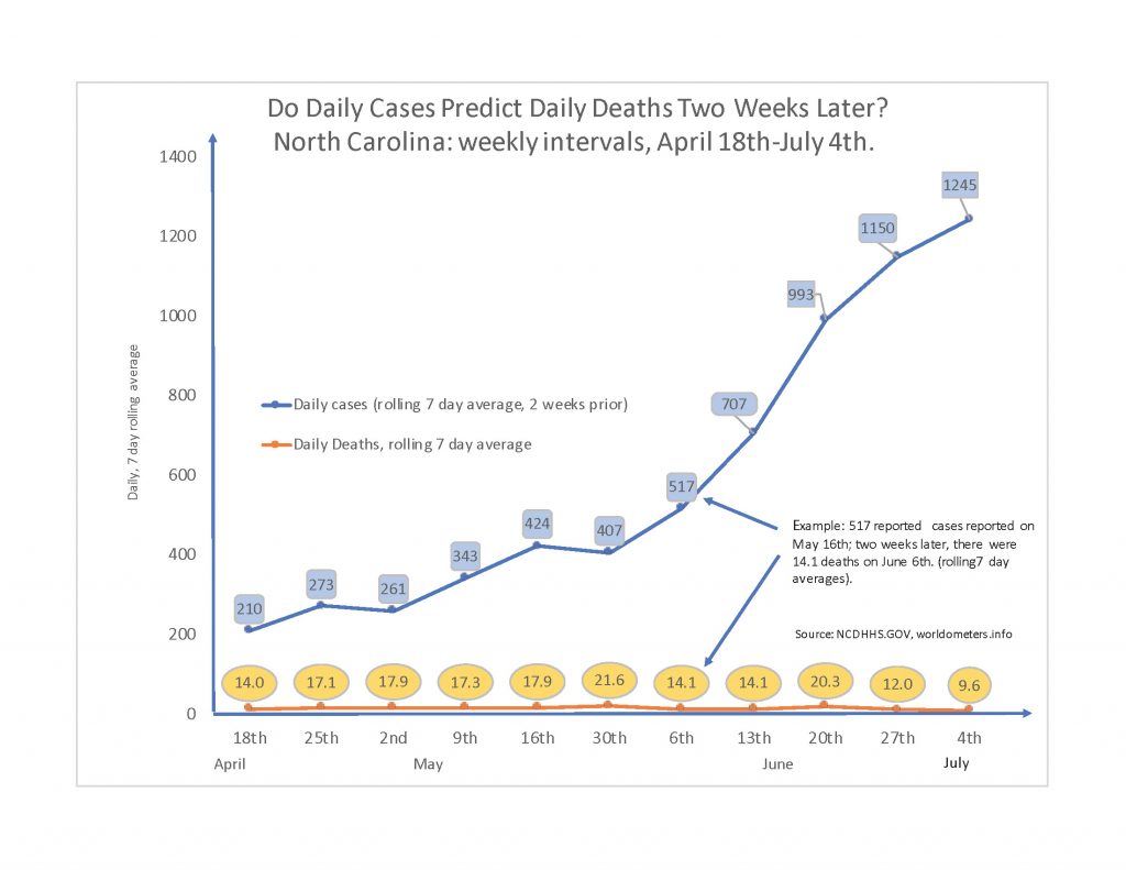
Figure 3 from the forthcoming study, focusing on North Carolina, is reproduced below. This chart reports the seven-day moving average of new daily cases on a benchmark lag period of 14 days. There seems to be no connection between deaths on any given day and cases two weeks prior. For example, compare the two dates May 2nd and June 6th. On May 2nd, the seven-day moving average of deaths came in at 17.9, and this corresponded to 261 new cases two weeks prior. More than a month later on June 6th, deaths had declined to 14 even though corresponding cases two weeks prior had spiked to 517. Over this interval, the empirical relationship is actually negative. By June 20th, confirmed cases two weeks prior had skyrocketed to 989, yet thankfully the increase in deaths was far less than proportional, from 14 to 21 on the seven-day moving average. By June 27th, cases two weeks prior had spiked to 1,161, yet deaths had thankfully decreased to 12. Again, spikes in cases may be cause for concern, but that need not include the concern that deaths will soon spike later. If anything, the relationship could be negative.
As for hospitalizations, Round 2 states show a gradual and relatively predictable increase over time, not the rapid and chaotic increase, followed by a plummet, that Round 1 states experienced. For context, Figure 4 from the forthcoming study compares daily hospitalizations for North Carolina (population is 10.5 million) and New Jersey (8.9 million). As one can easily see, the two profiles are entirely different. New Jersey, saw hospitalizations rise dramatically to over 8,000 on a single day in mid-April, before declining gradually since then. By comparison, North Carolina has seen only the slightest gradual upward drift in hospitalizations. Even at the end of June, New Jersey still had a more elevated number of current hospitalizations. If ever there were evidence of flattening the curve—i.e., keeping it flat in the first place—it could be North Carolina’s trend line of hospitalizations.
