Meet Adam Mottershead
Our content marketing specialist, Allie Todd, sat down with Adam Mottershead to talk about his recent work on water rights with newly appointed Center for the Study of Free Enterprise (CSFE) Director, Sean Mulholland, and Adam’s future aspirations in the field.
Adam recently graduated from Western Carolina University (WCU) with a degree in natural resource management and a cultivated passion for natural resource economics after taking a class with Professor Sean Mulholland.
Growing up involved in Boys Scouts and an Eagle Scout himself, Adam loved the outdoors. WCU became the place for him to fuel his passions for academia, the outdoors, and economics.
Now a graduate, Adam is still in the area, taking additional mathematics and economics classes at WCU in preparation for graduate school in the field of natural resource economics. Adam is also assisting Sean Mulholland on further research on stream restoration and banking.
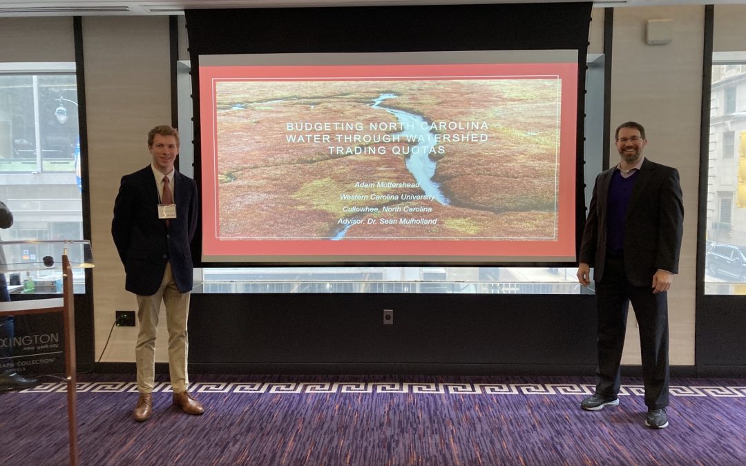
During his time at WCU, Adam became interested in water use in North Carolina. After a bit of digging, he discovered that most watersheds had excess water available. But, a few watersheds, particularly the Upper Neuse, home to Raleigh and Durham, were in deficit. His findings, “Budgeting North Carolina Water through Watershed Trading Quotas,” were published in the latest issue of the Issues in Political Economy journal.
This research focuses on the watersheds in North Carolina and how adopting a new policy of percentage-based trading quotas could potentially ensure an adequate amount of water for all residents. This new policy would differ from other policies throughout the United States, especially on the West Coast, as this would reassess the water availability every five years. This would mean the percent allotted would stay the same for residents, but the gallons per percent would shift upon reevaluation. The voluntary trading model of this policy would largely leave current daily water use unaffected while at the same time, encouraging water conservation through trading.
The implementation of this policy, or a policy of this nature, would allow for both trading and conservation across the state, while allowing for the watersheds in a deficit to achieve dynamic equilibrium by purchasing from watersheds in surplus.
The water rights allocation would provide users a water right claim that they could use, lease, or sale. “The hope is that through this market, people will have a method of trading. This incentivizes conservation of water through residents finding ways to reduce their water use and sell a surplus,” Adam said, continuing, “Another added benefit that we think would happen from this system is the development of a water infrastructure grid throughout the state. So just like electricity where you can buy and sell energy back into the grid, you could buy and sell water back into the grid.”
This detailed, thoughtful research led Adam to presenting his paper at the undergraduate research sessions of the Issues in Political Economy Conference in New York City in February of this year. This conference allowed him to gain valuable feedback to propel his research forward. He also presented his findings at the SoCon Undergraduate Research Forum this fall.
Adam is currently serving as a research assistant for the CSFE and is investigating stream restoration, banking, and water quality across the United States. We are very excited to welcome Adam Mottershead into the CSFE community and to continue to witness the impact his continued research has on not only the immediate community, but North Carolina as a whole.
Thanks to Adam for making his work a part of CSFE.
Meet Betsy Butner
Continuing with highlighting our 2021-22 Faculty, Student, and Graduate Affiliates, we are happy to introduce one of our Graduate Affiliates, Betsy Butner.
Graduating from the Master of Social Work Program in May, Betsy is rounding out her collegiate career that began when she graduated from Salem College with her bachelor’s in Biology and Spanish. After graduating, she worked in a BioTech company for four years, along with independently using her license in massage and bodywork therapy.
Last April, we introduced the CSFE community to Faculty Affiliate Emma Miller, MSW, LCSW. Emma is an Assistant Professor of Social Work and the U.S. Health Resources and Services Administration’s (HRSA) Behavioral Health Workforce Education and Training Program for Professionals (BWHET) Project Coordinator. She has been working with CSFE, focusing her research on posttraumatic growth in response to the COVID-19 pandemic.
The shared traumatic event that is the COVID-19 pandemic has changed the way that our lives are operating on a daily basis and it has caused various other aspects of society to shift along with that. Emma’s research considered experiences in Western North Carolina as a way to extrapolate a helpful perspective for societies on a global scale.
Now, Betsy has joined this research initiative, aligning her beliefs and education into one.
“We are working towards developing the curriculum and making sure it stands with the positive psychology but maintaining a level that is not engulfed in academia,” said Betsy, continuing, “We want to be able to share this with any community member, for everyone to have access to the same tools.”
From this research, Betsy aims to influence human connection and provide the tools to bring together community, “This whole experience [the COVID-19 pandemic] has shown people different perspectives of community and what it offers,” said Betsy.
Throughout the process of posttraumatic growth post-COVID-19, the greatest strength lies in the ability to grow as a community while continuing to develop using the tools we have at our disposal.
After graduating in May, Betsy hopes to continue with this research as a mentor for the graduate student who takes her place along with her own line of scholarship as well, with the expectation of making monumental impacts on her community.
We are happy to introduce Betsy to the CSFE community and are excited to watch her along her journey.
Meet Libby Weitkamp
Last week, our content marketing specialist, Allie Todd, sat down with CSFE’s newest Student Affiliate, Libby Weitkamp, to talk to her about her academic career at WCU and work with CSFE Director, Edward Lopez.
From Wake Forest, North Carolina, Libby graduated from Heritage High School, where her love for research began. Apart from the importance of research, her heart also lies in the community. Community is one of the many reasons that she chose to come to WCU. She wanted to be able to combine her research goals with her love for helping her community.
Now a sophomore at WCU, Libby is majoring in Innovation Leadership & Entrepreneurship with a minor in Economics. Her first economics class at WCU is where her interest in economics began, specifically, the concept of moral hazard. Libby stated that “the ability to explain behaviors in an analytical way was incredibly interesting to me.”
Thus began her path to becoming a CSFE Student Affiliate and assisting Dr. Lopez on his research endeavors this semester.
Earlier this February, CSFE published “Is now a good time to be optimistic?” which Libby was an integral part of.
“Optimism research was fascinating, it was very interesting to learn about optimism as a characteristic and how that impacts the economy, the workforce, and other variables of everyday life,” said Libby.
This study focused on building onto what we already view economic progress to be, how we can shape discussion based on what the collective view of progress is, and how optimism coincides with many measurements of human betterment.
“Our research is directly related to our community and our way of trying to understand better how they [our community] view economic progress,” said Libby. She continued by saying, “that way, we can build the foundation on which there can be further discussion between the community, economic developers, urban developers, and economists; and how we can pursue economic development in a way that is more unified and supported.”
This semester, Libby is also working on designing a survey to gather and understand peoples’ attitudes regarding economic development and growth, which is a part of CSFE’s Human Progress Research Initiative.
We are very excited to welcome Libby Weitkamp as a Student affiliate and to witness the impact of her research throughout her WCU academic career and beyond. Libby is also a member of the Brinson Honors College Board of Directors, co-chair for the Community Service Committee, a yoga instructor, and very involved in her sorority Delta Zeta.
On the horizon, Libby would like to attend graduate school for behavioral economics, and potentially receive her doctorate and teach economics at the collegiate level.
Thanks to Libby for making her work a part of CSFE.
Meet Heidi Dent
Heidi is an assistant professor of marketing in WCU’s College of Business. Prior to arriving at Western, she worked in industry for 25 years. In April 2020, she finished her Doctorate in Business Administration from Jacksonville University after selling the company she owned with her husband. Her research interests include marketing technology, artificial intelligence in marketing, and online consumer behavior.
Blending her passion for artificial intelligence and online consumer behavior with her industry expertise, Heidi is working with a local resort retailer to build and use an artificial intelligence-powered chatbot to measure applicant experience and engagement.
“Western North Carolina has a unique combination of retirement, tourism, and students and employers are struggling to try to find people,” Heidi said. “If we can utilize tactics to better engage prospective employees, as well as overcome any potential suppressing obstacles, we may be able to engage a larger prospective applicant audience.”
Heidi is also very interested in understanding how people engage with technology and thus creating an experience that is more positive rather than negative. “We want to create experiences that are more engaging than not, as well as open doors for individuals who may have not been considered otherwise,” said Heidi. Focusing on Western North Carolina, leveraging technology has the potential to impact economic distribution through our region.
In addition, Heidi has also been working with one of our other Faculty Affiliates, Martin Tanaka, to analyze industry/academic collaborations and what factors might show potential for successful collaborations. Collaborations between industry and academia benefit students, faculty, organizations, and ultimately the economic region. Look out for Martin’s discussion of this research in a CSFE Issue Brief coming up later this year.
Technology is already a part of our daily lives, and by continuing to monitor how we interact with it and how it could be best utilized, there is huge potential to directly impact our society.
“Awareness is the first step to building the future that we want to see,” said Heidi.
We are excited to see Heidi’s research and work with her this year. Welcome aboard!

Meet Craig Richardson
Happy fall, everyone. We want to begin to introduce the newest Faculty Affiliates of our 2021-22 cohort. Last week, CSFE Content Marketing Specialist, Allie Todd, talked with Faculty Affiliate Craig Richardson about his work as director of the Center for the Study of Economic Mobility (CSEM) and his involvement with CSFE.
Craig is a BB&T Distinguished Professor of Economics at Winston-Salem State University while overseeing the center’s research team of CSEM Faculty Fellows and working with Associate Director Alvin Atkinson on community outreach and student internships.
The mission of CSEM is focused on exploring the causes for the extraordinarily low economic mobility in Forsyth County, North Carolina, where Winston-Salem State University is located. It seeks to implement programs to enable people to gain economic mobility.
CSEM recently partnered with the New America’s Future of Land and Housing program on their “The Lending Hole at the Bottom of the Homeownership Market” report. This report analyzes what is stopping millions of would-be homeowners to acquire a mortgage.
One of the reasons for these problems with affordable housing are the effects of government regulations, like the Dodd-Frank bill. The regulations and the Dodd-Frank bill make it nearly impossible for people to get a mortgage for less than $70,000 since banks do not find it profitable since the 2008 financial crisis. Below is a graph from the report, detailing the profit line for banks to currently lend mortgages with these regulations in place.
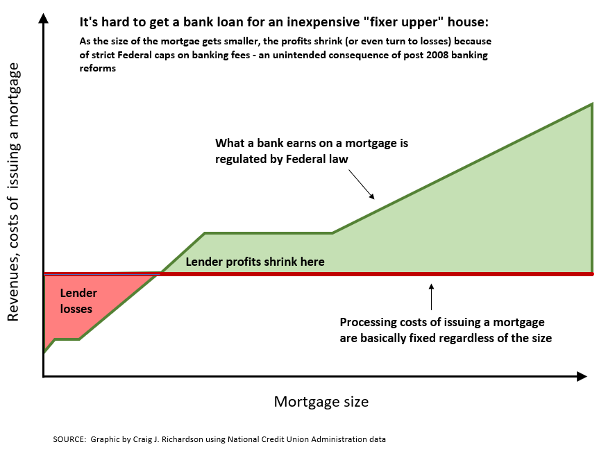
“This wrinkle in affordable housing has received very low attention,” said Craig, “There are already a lot of affordable homes out there, but the rub is that people cannot get credit. They cannot get a mortgage for those homes.”
Across the country, and in Forsyth County specifically, this phenomenon disproportionately affects people based on socio-economic status. The Dodd-Frank bill was supposed to protect small homeowners from being exploited by predatory lending practices, but in turn, made it nearly impossible for people to get a mortgage for an affordable home and allowed investors to buy these homes in all-cash purchases.
“We at CSEM are always thinking about doing more than just a report, but actually getting the facts in the hands of people who could potentially make changes,” said Craig. “We think that there’s a role for the banks if they want to get involved, and if they want to get involved, they should put more resources into small mortgage lending practices.”
This report has been picking up quite a bit of media attention, even landing a spot in The Washington Post, Bloomberg, as well as Craig’s in-depth radio interview with WFDD, an NPR affiliate.
For his work with CSFE, Craig has been working with CSFE Director, Dr. Edward Lopez, to research how COVID-19 cases are changing as the virus moves through different populations, trying to develop some sort of metrics around predicting how that might change. Keep up with our social media and our website for upcoming information on this research.
We are proud to work with Craig and CSEM, and excited for him to be a part of CSFE’s 2021-22 Faculty Affiliate cohort.
Catching up with Tyler Tarbet
We occasionally use this blog to catch up with our former students who are now on to great things. Today, we are “Catching up with Tyler Tarbet.”
Tyler is a 2018 graduate of Western Carolina University who majored in computer information systems and minored in economics. It was through his minor that he met CSFE Faculty Affiliate Angela Dills and Director Edward Lopez and began to explore this passion for economics by joining the North Carolina dashboard project. This year, Tyler graduated with a Master’s in quantitative economics from West Virginia University and is joining CSFE as a research assistant.
Let’s catch up with Tyler!
Q1: Let’s dive right in! Tell me a little bit more about your academic journey and how you got to where you are today?
I’m from Charlotte, North Carolina, and I went to a school called Charlotte Catholic high school. From there I went to Western Carolina University, that’s where I met Dr. Lopez. My major was computer information systems, throughout that we took a lot of business courses and one was microeconomics and that class really drew my interest. So I started to talk to some of the professors there and I decided to get my minor in econ because, at that time, that’s the only thing that they offered. I started my senior year working on the dashboard project that they did for North Carolina. That really solidified my strong interest in econ and research analysis. Right after school, I got a job back here in Charlotte as a business data analyst. Fast forward to May of 2020, I reached back out to Dr. Lopez and I said, “Hey, you know what, with a lot of schools doing things remotely right now, I wonder if you have any online opportunities that you’ve heard of.” He happened to hear of a program at West Virginia University, a first-time quantitative econ Master’s program. It was a one-year program from August of 2020 to August of this year.
Q2: Exciting! I’d love to hear more about your academic journey, the master’s program in quantitative econ, and how you got to where you are today?
As I started learning, because I took an econ class in high school, which was very surface level. But then at Western, you’re able to apply some of the knowledge and the learning actions in these economic classes. It allowed me to really cipher through what’s actually happening. From there, that’s what really made me want to tackle the idea of school choice because, throughout my life, I’ve always known how privileged and fortunate I was to have the opportunity for private education. Now that I have the tools and understanding, how can I start to answer questions about how do we make things better? How can I apply that to ideas around school choice? So I guess that would be the main thing, if there are things in life that you feel very passionate about, but you don’t really know where to start, take some of the ideas you’ve learned from classes, start to do some research on it and see what dots connect in a natural way. Just let it flow.
Q3: Exciting! So, I hear you are helping the Center out by being a research assistant? Tell me more about that.
When I graduated from Western, Dr. Lopez knew I had a strong background in computers, websites, and databases because of the work I did for their dashboard. So the summer after I graduated from Western, I was helping them [CSFE] rebuild the website. Dr. Lopez reached back out to me a couple of weeks ago saying that he wants to work on rebuilding his website, work on some of the center’s website, and at the same time he wants to have somebody help him with some research. It’s kind of an open-ended thing, one of the topics we want to look at is COVID and how did/does that impact everything?
Q4: Well, welcome back to the team! I’d love to hear some advice you have for people who are looking to pursue a master’s in econ?
Well, I think the first thing is to figure out, if you can, what you want to focus on because there are different versions of that. So, you can get a master’s that is more theory-based, or this one is more quantitative-based. The first thing would be okay, what are you trying to get out of it? Are you trying to become an academic? Or are you someone who wants to go work at a big bank or are you trying to work in a policy institute? If you can veer one way or another, that will help you select a kind of program. And then from there, people who are really interested in policy, whether it’s for the private sector or public sector or even nonprofits, you know, doing that program at WVU, really lends itself to a lot of that opportunities because they have tremendous connections, tremendous resources.
Stay connected with CSFE here on our blog or on our social media channels for more updates and stories!
Introducing CSFE’s Human Progress Research Initiative, and Calling 21-22 Faculty & Student Affiliates
What counts as economic progress in our region? That question is near and dear to so many, especially as we all continue adapting to pandemic disruptions. So, this year CSFE is launching a year-long research project combining different perspectives from various colleges and disciplines on campus. We aim to support a range of faculty and students whose work helps answer a common question: “What counts as human progress, and what steps can be taken to achieve greater progress in WNC and beyond?”
From my discipline’s perspective, economics offers what many consider a deceptively simple answer: economic growth. By raising living standards over time, economic growth enables people to live longer, healthier, happier lives. Economic growth has been a core subject of economics at least since Adam Smith’s 1776 book, An Inquiry into the Nature and Causes of the Wealth of Nations. As Nobel Laureate economist Robert Lucas once quipped, “once you start thinking about economic growth, it’s hard to think about anything else.”
Yet the economic approach provides just one perspective, and other disciplines also provide insight by prioritizing differently. In social work, for example, we learned from 20-21 Faculty Affiliate Emma Miller and Graduate Affiliate Chelsea Sokolow that the pandemic was a mass-trauma event, yet people have the capacity through shared dialoguing to recreate personal and societal narratives, leading to post-traumatic growth. Similarly, in emergency response services, we learned from 20-21 Faculty Affiliate Jackson Deziel‘s work that the pandemic was a mass-casualty event, prompting innovative new training and field practices in the EMS professions, and calling on policymakers to update the regulatory environment in this critical area of health care.
The lesson is, human progress can be driven as much by public policy and genuine discourse as it can by economic growth. Still other perspectives on human progress prioritize a healthy climate, responsible commons, security, social justice, liberty, and more.
A year ago, we launched our CSFE Covid-19 Research Initiative. This year, with our Human Progress Research Initiative, we plan to offer the WCU community and the region practical insight and tangible next steps to further human progress around us. To that end, we are recruiting Faculty Affiliates with the invitation below. And we’ll continue to post updates throughout the year, so please follow and always feel free to be in touch with us along the way. Great things are coming!
Call for Faculty and Student Affiliates
Updated: September 1, 2021
Invitation: WCU’s Center for the Study of Free Enterprise invites Faculty Affiliates and Student Affiliates for 2021-22. This program is a hub of researchers from different disciplines and a platform that connects their work with academic, policy, and community audiences in the WNC region and beyond.
Background: To learn more about CSFE Faculty and Student Affiliates, see this news release and this roster of 2020-21 CSFE Affiliates, and also sample their accomplishments on the Center’s blog and our 2021 COVID-19 impact and recovery townhall site. Further background is in this post about how the Center defines free enterprise principles.
Areas of Support: CSFE’s formal mission is “to conduct scholarly inquiry, policy analysis, educational activities, and community outreach on the role of free enterprise in a flourishing society.” To that end, our support areas include research, education, and policy analysis that informs community development, economic progress, and human well-being. For 2021-22, specific areas of interest include regional economic progress, housing, infrastructure, broadband, transportation, jobs, manufacturing, health care, substance use, mental health, and long-term Covid studies. An area of focus for 2021-22 is cross-disciplinary perspectives on what counts as human progress in WNC and beyond.
Types of Support: CSFE Faculty and Student Affiliates receive a base-level financial support for the academic year and additional support for contributions including publications (e.g. CSFE Issue Briefs, blog entries, op-eds, more), presentations, and other contributions made during the year. Support may also be available for hiring student or non-student research assistance and to defray research costs that are not otherwise supported. CSFE support is designed to supplement WCU’s other institutional opportunities.
Generating Impact: The Center provides promotional support, marketing, storytelling, visualizations, and other distributions that distill and disseminate the faculty member’s work to public audiences. The Center organizes panel discussions and hands-on events that connect Affiliates with other academics in the southeast working on similar topics. Affiliates’ work is distributed through blog entries, social media, news interviews, editorials, and more. Faculty are encouraged to submit their work to Hunter Library’s Institutional Repository.
Timeline: The program duration is fall ’21 and spring ’22 semesters. Faculty Affiliates will be invited to share their work as opportunities arise throughout the year, as well as at CSFE events in the spring.
To Apply: Faculty and Students from any discipline are encouraged to apply. Interested faculty are invited to email us at csfe@wcu.edu to receive a brief application form. The application will ask for 250-500 words describing the Affiliate’s work plans and goals for the coming academic year, emphasizing its relations to the above Support Areas. We will also request a current CV and DCRD. Work that includes WCU students is especially encouraged! WCU students who work with CSFE Faculty Affiliates are automatically invited to CSFE’s Student Affiliates program.
Application Deadline: 5:00 p.m. on Friday September 21, 2021.
Broadband investment would mean billions to NC, but there’s a holdup: Utility poles
To be included in today’s digital world, all North Carolinians need access to reliable, high-speed broadband. Yet, today nearly 472,000 in our state – primarily in rural communities – remain without broadband access, limiting their options to work, learn, pray, socialize, see their doctors, and more. In a new co-authored study, I calculate the economic gains of connecting these homes and small businesses. The economic implications of broadband expansion for North Carolina are significant.
State and federal grant funds have recently been awarded to help defray the total cost of broadband expansion and bridge the digital gap that still exists in the state, particularly for rural communities.
Our new study finds that full realization of just one grant program we analyzed would create an estimated $3.5 billion in new economic gains to North Carolina businesses and households. This is a dollar estimate, using standard economic analysis, of the productive, commercial, educational, health, civic, and other social benefits that full broadband expansion would achieve.
In many cases, however, the buildout process can be held up, thus delaying or preventing connections to unserved rural homes. In North Carolina, as in many other parts of the country, utility poles form the backbone of broadband infrastructure, particularly in rural areas. The public’s return on its broadband investment requires efficient, equitable attachment of broadband wires without delay to existing utility pole networks. Unfortunately, current policies give pole owners – primarily municipal and cooperative electric utilities — significant market power over access to these poles.
Significant concentration of market power over an essential input in an otherwise competitive ecosystem always harms the public interest. In too many cases, pole owners use this advantage to impose lengthy timetables, demand costly permitting fees, enact unnecessary pre- and post-construction requirements, and make broadband deployment costs unfeasible for internet service providers who need to attach to these poles. These opportunistic practices often delay and prevent broadband expansion to the “last-mile” regions that need internet service the most.
State leaders can take steps to improve the utility pole hold up problem and more quickly bring broadband to every corner of North Carolina.
First, the rules of the game should promote efficient and equitable cost-sharing arrangements between attachers and pole owners. This should ensure that pole owners are compensated adequately so that broadband providers can maintain cost-feasible plans for new broadband infrastructure buildouts. The rules should scrutinize broadband providers bearing the full burden of replacing aging poles as a precondition to new attachment, and should instead take into account the age and net book value of the replaced poles.
Further, the rules of the game should reduce transaction costs by providing reasonable time frames for the process of attaching broadband cables to utility poles – called “make-ready work” within the industry – which includes everything from permitting to renting space for equipment to replacing old or out-of-code poles. Current delays caused by ineffectual and complex pole regulations can result in setbacks of up to a year – another year in which the unserved communities remain without access to the internet.
Fortunately, the North Carolina House of Representatives is taking action to close this digital divide by investing American Rescue Plan funds to help with the cost of new utility poles and establishing reasonable timelines for the work to take place. If the North Carolina Senate and Governor also support, it will allow broadband providers to connect more rural North Carolinians to high-speed broadband and will be able to do it faster.
The time for efficient and equitable policies that reform the utility pole hold up problem cannot come soon enough. We estimate delayed broadband expansion forfeits $14 to $16 million of economic gains per month, or $186 million per year. By streamlining our state’s utility pole policies, North Carolina will not only more effectively use dedicated public funds intended to connect every corner of our state, but also spark our entire state’s economy.
Reprinted from WRAL TechWire, August 26, 2021. Editor’s Note: Edward J. Lopez is a Professor of Economics and the Director of the Center for the Study of Free Enterprise at Western Carolina University.
Utility Poles: Key to Achieving Full Broadband Access in North Carolina*
Robert Cooter and Thomas Ulen’s classic textbook, Law & Economics 4th Edition, describes the concept known as the Hold Up Problem. A hold up is a market actor who possesses and exercises market power to interrupt others’ ongoing physical investment projects. It is typically a threat to extract rents by imposing monopolistic terms of exchange on others, thus distorting investment plans. Since hold ups soak up real resources, they are recognized in economics as a form of market failure whose remedy, most generally stated, is to reduce the relative disparity of market power between the hold up actor and others. Against this backdrop, I have studied broadband expansion in North Carolina. The op-ed below lays out the issue and, as I understand it, how it relates to the law & economics concept known as the Hold Up Problem.
—
Earlier this year I had the honor of judging an annual statewide high school economics competition. Having “gone virtual,” as countless other events during the pandemic did, this contest gathered small teams of students and teachers from across North Carolina to put their skills on the line. It was an inspiring day, filled with tangible displays of young people accomplishing great things together and building brighter futures for themselves and each other.
But it was also a concerning day for me, because as a judge I noticed the fine print. It said only students who have reliable high-speed internet access are eligible to compete. Immediately my thoughts went to the thousands of children who have the skills and want bright futures, but who lacked access to these gatherings. This was the so-called digital divide staring me in the face.
The pandemic has made even more urgent the need to close that divide in North Carolina, to connect the nearly 472,000 people mostly in rural areas who remain stuck on the wrong side of it, and to provide equal access to high-quality broadband throughout the state.
Thankfully, our state leaders have been on the job with initiatives that include the Growing Rural Economies with Access to Technology (GREAT) program designed to incentivize broadband expansion. Yet many barriers continue to stand in the way.
One barrier comes up when broadband providers are ready to run wire to people’s homes but then have trouble connecting to utility poles along the way. This happens when the owners of utility poles—oftentimes municipal and electric member cooperatives—use their unique position to impose onerous conditions on broadband providers.
Want to connect to our utility poles? No problem, the “Munis and Coops” effectively say. Just adhere to these arbitrary timetables and permitting fees, these new pre- and post-construction requirements that we have just rolled out, and please foot the bill for replacement of poles where we say new ones are needed. Known in the business as “make ready” fees, these onerous terms can add up quickly, turning what would have been feasible expansions of broadband into unfeasible ones. As a consequence, fewer Carolinians get connected, and the digital divide gets worse.
A fairer process for pole attachments would prevent such barriers from coming up and would clear the path for full broadband expansion in North Carolina. Lawmakers in Raleigh have taken up this very point during the current session of the General Assembly. Proposed legislation would streamline the pole attachment process and update old regulations that once served the public interest but now simply create privileged positions for certain pole owners, namely Munis and Coops.
These legislative proposals would ensure that critical infrastructure upgrades are not unreasonably delayed, for example by establishing consistent formulas that fairly and efficiently split the costs of pole replacements. The proposals would also speed up the process, for example by setting reasonable timeframes for pole preparation and by empowering the NC Utilities Commission to resolve disputes faster.
North Carolina’s rural population is the second largest in the country, second only to Texas, and far too many in our state have been stuck on the outside looking in, looking for opportunity.
It’s not just the school children yearning for their digital tickets to statewide competitions. It’s telehealth patients, job applicants, church goers, citizens, voters, you name it. Instead of remaining vulnerable to outdated legal rules that privilege certain pole owners with the power to hold up broadband expansion, our state deserves better. Closing the rural/urban divide and realizing a connected future for all Carolinians is now more important than ever.
Edward J. Lopez is a Professor of Economics and the Director of the Center for the Study of Free Enterprise at Western Carolina University.
*Printed in Asheville Citizen-Times, Sunday August 1, 2021
Our New Annual Report, 2020-21
 Check out our new annual report, just released today!
In the summer of 2020, as we sat down amidst those uncertain times to hash out plans for the 2020-21 academic year, I wrote the following vision statement for the Center:
We produce high-impact research in three main areas: COVID-19 impact, evidence-based policy analysis, and free enterprise solutions for bottom-up recovery. We have a positive impact on the students, faculty, and community of Western Carolina University. We improve the climate of ideas and public policy in North Carolina.
Now a year later, as we publicly present our 24-page Annual Report for 2020-21, I am glad to say that we made progress in all respects of of this vision statement, and more. I invite you to take a few moments and enjoy seeing for yourself within the pages of our report. I paste below the opening letter / director’s welcome as a sneak preview. Here you can download full report as PDF.
1. Director’s Welcome:
Happy 5th Birthday! With this annual report, we celebrate not just the Center’s past year but also our first five years in operation.
Since launching in Spring of 2017, CSFE has supported 68 faculty projects and 114 student projects. We have published 14 original studies in our flagship series, CSFE Issue Briefs—Hard Research, Easy Reading, plus a related 7 op-eds in North Carolina papers. In addition, our first five years have provided 37 real and virtual events with a total of 3,657 attendees. We have hosted memorable conversations with Apollo 16 astronaut Charlie Duke, Home Depot co-founder Ken Langone, and author of We Need to Talk Celeste Headlee, among many more. We host annual research workshops and year-end community programs for our region, including our 2019 Opioid & Addiction Awareness Campaign and Town Hall, when we welcomed Senator Shelly Moore Capito (R-WV), North Carolina Senator Jim Davis (R), and a large group of academics and community members, and our four-part 2021 COVID-19 virtual series that drew national audiences.
Through these programs and more, CSFE has developed a network that gathers over one hundred faculty and students from WCU and beyond, integrating them with community members and policymakers from the southeast region. By combining perspectives from economics, accounting, engineering, psychology, nursing, social work, and more, CSFE is a hub and platform for cross-disciplinary research that matters.
As Director, I am very thankful to work alongside the people whose talents and hard work make CSFE possible. Starting with the steady hand of WCU’s administrative leadership, CSFE has depended crucially on the support of Chancellor Kelli R. Brown, Provost Richard Starnes, and Dean AJ Grube and her staff, especially Teresa Starrs and Nancy Liddle. Likewise, the Center’s Advisory Board has been a trusted body, and its members have opened so many doors over the years. The entire team at University Communications and Marketing, especially Bill Studenc, Geoff Cantrell and Sam Wallace, have been immensely supportive and enjoyable collaborators.
As the Center’s backbone, our Faculty and Student Affiliates, including Associate Director Sean Mulholland, have powered the Center. The pages of this report are filled with their accomplishments. I am so fortunate to partner with these excellent people, and to help them generate cross-disciplinary research that matters.
Last but certainly not least, I am honored and grateful to work alongside the Center’s staff, Allie Todd who artfully coordinates our digital presence, and Jane Wiggins, whose skillful imprint on the Center as Events & Operations Manager is truly hard to overstate. I am honored and grateful to call them colleagues.
Looking ahead, CSFE and its people are on a sustainable path. So, I thank you for taking a look at this annual report, and I invite you to follow us at enterprise.wcu.edu and our social media. The best is yet to come!